


The architecture in Sci-Fi Movies inspired me to design a deserted alien landscape.


This is my graduation project for Station Nijmegen in the Netherlands.
Station Nijmegen has a surface area of circa 2 Hectares and perfectly designed for logistics, rather than the pedestrians. The area had so many little by little design revisions which led to a incoherent public space. Nijmegen is building some new amazing spaces, but the station has somehow been left behind.
L to R: Three areas, No sight, Barriers, Busroute

L to R: Pedestrian route, Sitting area/city beginning, Different architectual styles, Scale
The station is made for dinosaurs, not for humans
The most important aspects I wanted to focus on are making a pedestrianfriendly cityspace, an intuitive wayfinding towards the city, follow trough with one existing architectual style, and bringing back the size of the square to a humane scale. This is brought to life trough a few principles.

Extrapolation of the Italian arches found on the site, which are designed by Sybold van Ravesteyn.

Creating height differences to make smaller spaces

Using the existing architecture to layout a grid, which gives room for arrangement of the square

Simplified layout
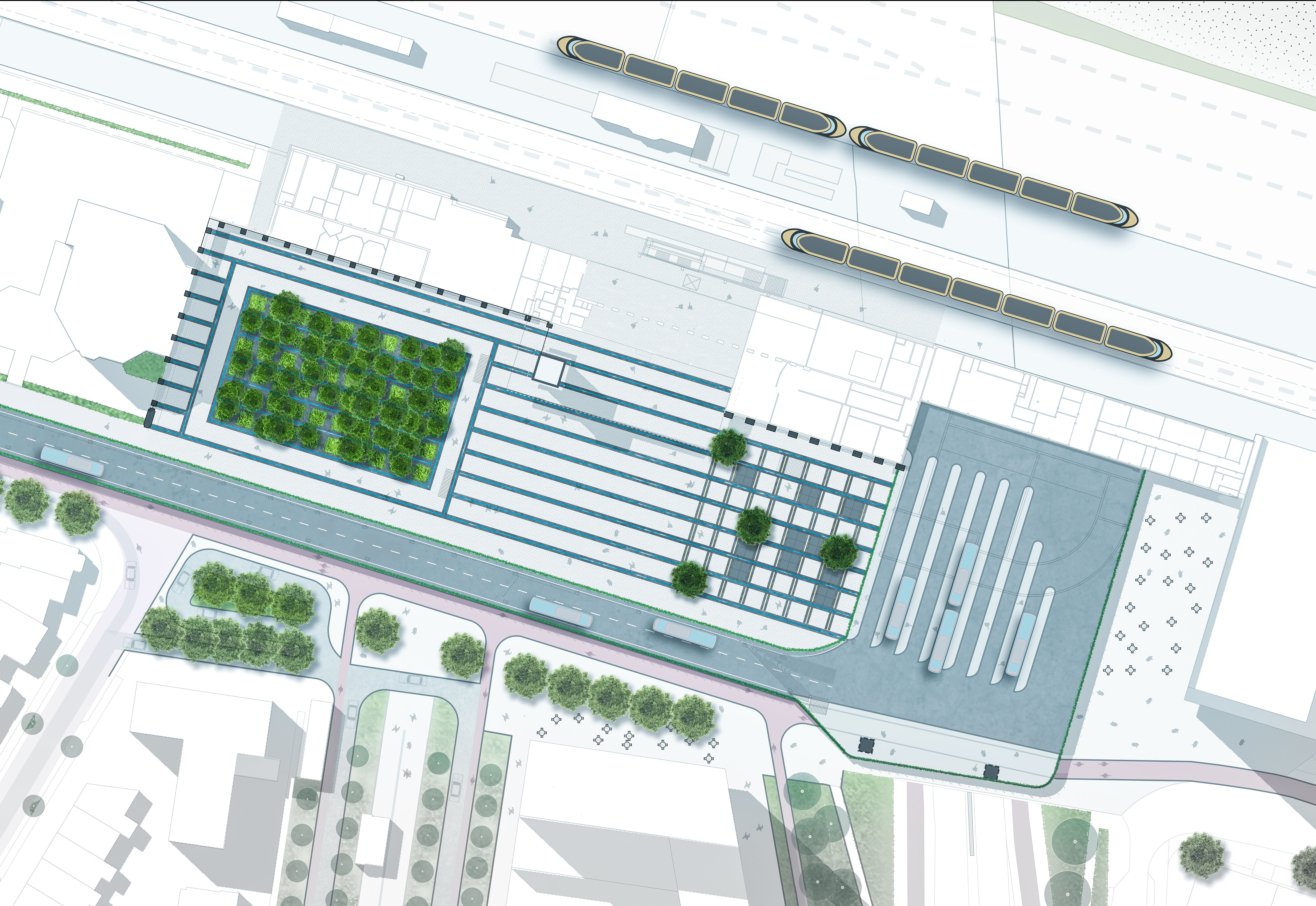
Siteplan
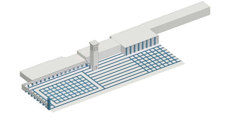
Grid taken from the existing architecture

Relaxing and functional area

Green/shadow and sunny/open areas

Watersystem, everything flows to the Oasis, where is being reused

airconditioning and smelltransfer with the windcatcher principle

New functions, sight, and walkingroute

Heightened busstation and route

In the Oasis
Section Oasis
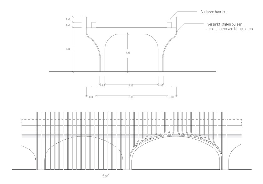
Heightened busroad

Oasis from groundlevel
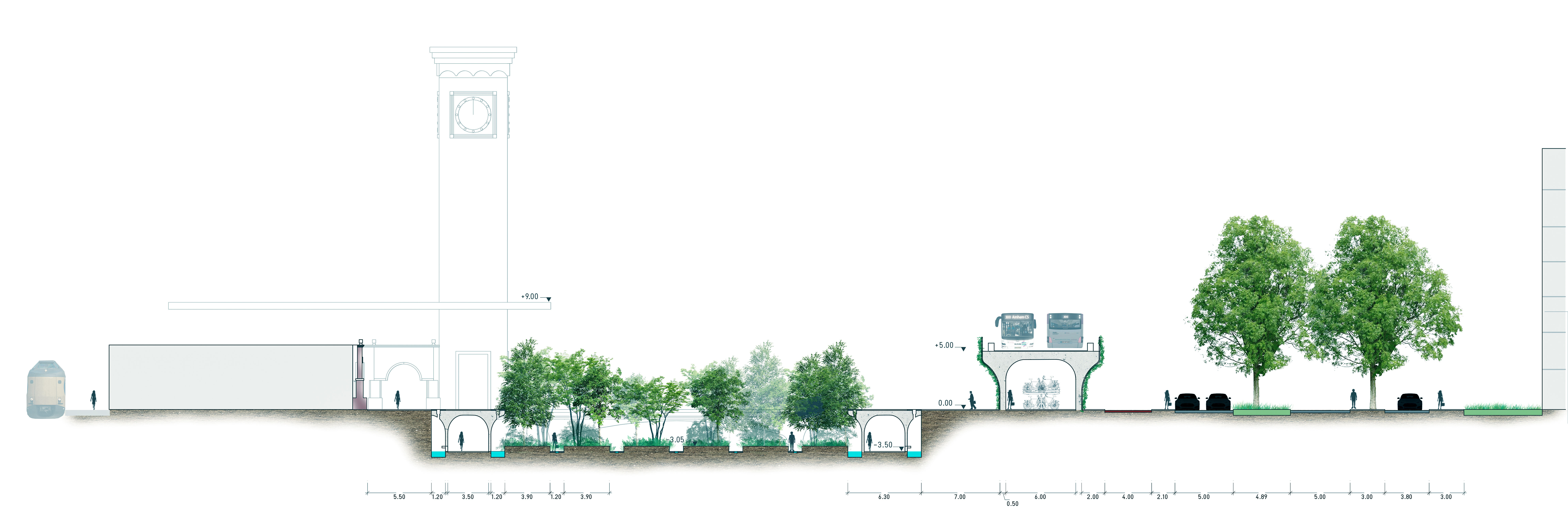
Section middlesquare
Arrival on the station from the city
Section functional sunny area

Section busstation

Arrival from trainstation
This is my graduation project for Station Nijmegen in the Netherlands.
Station Nijmegen has a surface area of circa 2 Hectares and is perfectly designed for logistics, rather than pedestrians. The area had so many little by little design revisions which led to a incoherent public space. Nijmegen is building some new amazing spaces, but the station has somehow been left behind.
Together with Nick Nieuwland I made a animation before we started on the project. It was to expand our skill set.
L to R: Three areas, No sight, Barriers, Busroute
L to R: Pedestrian route, Sitting area/city beginning, Different architectural styles, Scale
The station is made for dinosaurs, not for humans. L to R: Human, Brachiosaurus, Tyrannosaurus rex
The video beneath gives an impression of usage in a 2 hour time-span. You can see the high intensity traffic and the dangerous pedestrian crossings.
The most important aspects I wanted to focus on are making a pedestrian-friendly city-space, an intuitive way-finding towards the city, showcase one existing architectural style, and bringing back the size of the square to a humane scale. This is brought to life trough a few principles.
Extrapolation of the Italian arches found on the site, which are designed by Sybold van Ravesteyn.
Creating height differences to make smaller spaces
Using the existing architecture to layout a grid, which gives room for arrangement of the square
Simplified layout
Siteplan
Grid taken from the existing architecture
Relaxing and functional area
Green/shadow and sunny/open areas
Watersystem, everything flows to the Oasis, where is being reused for cooling and irrigation
Airconditioning and smelltransfer for the station with the windcatcher principle
New functions, sight, and walkingroute
Canopy, heightened busstation and route
In the Oasis
Section Oasis
Heightened busroad section and frontview
Oasis from ground level
Section middle square
Arrival on the station from the city
Section functional sunny area
Section busstation
Arrival from trainstation
The architecture in Sci-Fi Movies inspired me to design a deserted alien landscape. The design is heavily influenced by Blade Runner, Prometheus, and Halo.

The second assignment for the Major garden architecture was an assignment for a park on the city-moat of Gouda.
The city is famous for its cheese and stroopwafels. But the public space is not on the same level as these products. That is why the city needed a new modern design.

The location of Gouda within the Netherlands surrounded by the well known places.

Difference in outline of the peatlandscape

L to R. Enterances and route to downtown, Enterance and moat ambiance, formal outer ring and informal innerring

L to R: Greenstructure analysis, entrance and route in project area, sight from surrounding places.

Picture analysis showing the volume of an appartmentcomplex

Concept: accelerate, slowing down, and stopping
The concept comes from the analysis that shows that the inner and outring have a difference in usage. On the outering people move quickly from A to B, while the irregular placement of trees hinders movement and promotes lingering.
The other important aspect is that the blind spot, which can connect the center with the moat. This is an area with great potential, which will vanish if a big apparmentcomplex divides and blocks the space

Masterplan partial city-moat

Cross section acceleration outerring.

Transition from existing pavement

The three zones and their function

Detail design.
On a more detailed level you see that there are three distinctive zones, eacht ment for for a different target groups. The cultural and library zone are connected by a building with a public first floor.

Lazarussteeg

Cross section Lazarussteeg

Pavement detail around the pergola

Pergola construction.

Visual Lazarussteeg.

Koningsplein

Principle section illustrating shape of the

Detail koningsplein

Koningsplein visual

Section Koningsplein and Erasmushof

Walking route.
The walking routes decide where the placement of restaurants will be. These will be placed in the crowded area’s to promote even more lingering.

Koningsplein visual

Lazarussteeg

Detail stairs

Erasmushof visual
